Wednesday, January 28, 2009

Real Brides: Lee and Mark - December 13, 2009

images courtesy of Z Media - www.zphotocouture.com

Lee and Mark were referred to us by the fabulous Janet Capocci at the Sheraton in Cuyahoga Falls. We met with them when it was still 80 degrees outside - but with Lee's amazing communication and organization, it didn't take long for me to 'get on board' with the elegant winter wedding they were planning. Working with a color pallet of warm rich red, soft silver, and crisp black, we designed a 6x6 pocketfold invitation with a customized front square that we carried through to the ceremony programs as well. When Mark's mother came to town to visit, we met with her and Lee to design a rehearsal dinner invitation to coordinate. All three are shown below.
programs, wedding invite, rehersal dinner invite
images courtesy of Z Media - www.zphotocouture.com
Though I loved the invitations and programs, my favorite part of their order was the accessories. Lee and Mark wanted to name each table at the reception after a place that they had traveled together and also include a photo and description specific to the location. As I worked on the individualized layouts and got to know more about them, I just knew these table cards would be a big hit for their guests! Lee even got creative with the place cards using fun phrases such as "Join us for a drink at...", or "Your destination is...". We also provided the adorable snowflake place card holders which could double as table favors for their guests to place a photo or note in after the wedding.


images courtesy of Z Media - www.zphotocouture.com
Lee and Mark - you are the type of clients that we dream of working with! I especially loved that Mark was so involved in the process from start to finish. Mark - I will remember our goofy 10 minute discussion about inserting invitations into envelopes every single time I present a sample to a client! It is true that I actually cried a little when viewing your photos (a few of my favorites are below) and we already miss seeing you on a regular basis. You are such a sweet, loving couple and we wish you two the very best that life has to offer!


images courtesy of Z Media - www.zphotocouture.com

Vendor Recap - Who did Lee and Mark choose for their big day?


Ceremony: St. Bernard Catholic Church - Downtown Akron
Reception: Sheraton Suites - Cuyahoga Falls
Bride Apparel: Doreen Leaf - from Lee - "I loved working with Doreen Leaf - very personal, friendly service - they make you feel like a princess"
Groom Apparel: Men's Warehouse Tux
Cake:
Creme de la Creme
Floral:
Neil Leeson
Photography: Z-Media - from Lee before the wedding - "Z-Media has been awesome so far. We have only had our engagement pictures done so far but they turned out great!! They were very professional but also very friendly and easy to work with. We love them so far!" and later this " [You and Stacy and] Chris and Julie (Z Media) were our favorite people to work with. You were all so sweet and helpful, not to mention talented and creative. We could not have been happier with everything you all did!"
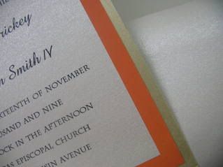
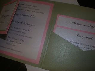
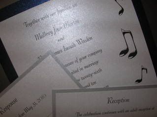
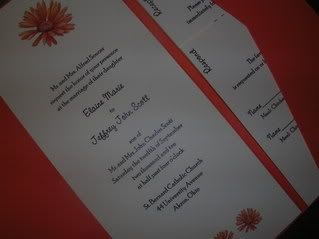
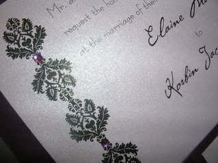
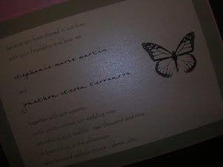
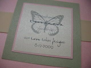
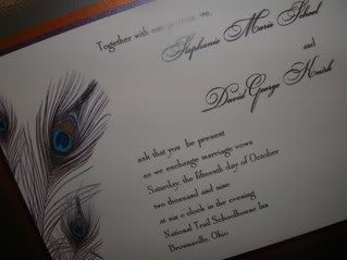
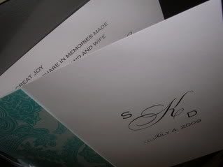
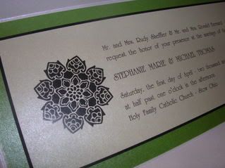
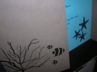
Invitations/Stationery:
Paper Persuasions (that's us!) - from Lee - We have received so many compliments about our invitations. We love them and so does everyone else :) You both have been absolutely amazing to work with. Your creativity and professionalisim is fabulous! Your attention to detail is outstanding. Not only do you do amazing work, you both are so sweet and friendly. We always looked forward to our consultations with you. You made a very daunting task managable and fun. We loved working with you and of course, absolutely love everything you created. Thanks so much for everything, xxx Lee and Mark

Catalog Invitation Pick of the Week

(Each week I choose a catalog invitation that is on my list of favorites and share it with you!)

My Pick of the Week: Tri-Fold Invitation with Respond Postcard by Diamond


These cute little invitations are a great mix between casual seal n' sends and elegant flat panels. The invitation is presented folded and tied with a ribbon. When opened, it reveals a beautiful scroll pattern carried throughout the invitation panel, the reception panel, and the attached respond postcard. This invitation has great style and won't break the bank! And since it uses a respond postcard instead of the traditional card and envelope, it requires less postage and uses less paper!

Choose from the following customizations:
11 colors of ribbon
18 colors of ink
20 lettering styles

Catalog: Diamond Collection by NuArt
Price Point:
75 ensembles: $2.50
100 ensembles: $1.95
150 ensembles: $1.80
200 ensembles: $1.71
(Approximate price per ensemble INCLUDING proofing, shipping, and tax)

Monday, January 26, 2009

Etiquette Question of the Week


Question: “What does the 'M' on the response card stand for?”
This is the most frequently asked question we get. Clients always seem embarrassed or feel stupid asking this question and we think its because they are afraid of the answer. They've all faced the 'm' when responding to weddings in the past - but did they guess correctly?!?! We're here to spare you the embarrassment (and hopefully confirm what you kinda already know).

Answer: “M” is the first letter of every salutation - Mr., Mrs., Miss, and so on. The guest is to complete their salutation followed by their name. For instance: Mr. and Mrs. Dave Knirk. Don't want your own guests wondering what to do with that pesky 'M'? A modern alternative to the pre-printed 'M' is the word 'Name'. Although about 50% of our brides select the more stratightfoward option, we're sure the traditional 'M' will stand the test of time.

Ask the experts! Submit your very own question on our website - you will receive an email response with the answer within 48 hours - plus your question could be featured in an upcoming blog or newsletter!

Saturday, January 24, 2009

Weekly Recap

WOW! That's all I can say. We are still swamped with traffic from the bridal show. It's been such a challenge going from 'appointment only' to accepting walk-ins...but I think we are doing a great job juggling things...like say two brides at once!

We've had more catalog activity than custom activity this week..and let me tell you, all shades of blue seem to be the theme. Pool, Cobalt, Cornflower, Navy, Aquamarine, Powder Blue, Hydrangea, Serene....How many more shades can there possibly be???

Despite all the craziness, we managed to take a few photos of custom invites we have worked on this week. All are samples clients have ordered or designed during their consultations.


teal blue invitation pocket
Tealness/Pool Blue/Aquamarine Pocketfold Invitation
Super cute invite for a bride we have met with a couple of times and had a chance to chat with at the bridal show. She brought in swatches of Pool Blue and Tealness - both Alfred Angelo.


chocolate brown and lime green wedding invitation
Chocolate Brown and Lime Green Pocketfold
This invite was for a client who found us online. She is having a private ceremony and sending out matching announcements afterwards but instead of the response and reception cards in the pockets, she is going to include a wedding picture in the pocket.


persimmon and champagne wedding invitation
Persimmon and Champagne Pocketfold
This invite was for another online bride. She hasn't even seen it yet - we just dropped it in the mail today! Great color scheme - its nice to see this shade with something other than chocolate brown.


sage and pink pocketfold wedding invitation
Sage and Pink Pocketfold Wedding Invite
This invite is actually for a bride we met with several months ago. We are finalizing her order in the next couple of days and had to put together the proof packet. We love this color combo! We've been doing alot of Hot Pink and Lime and so the warmth of these softer shades is a nice break!


music note invitation
Music themed Wedding Invitation
We recently designed this invitation for the sweetest couple! They met through music and really wanted to incorporate music notes into the invitation. Would you believe that out of all the catalogs we have, not a single one has a music themed invitation? Needless to say, this one turned out great. The couple is working with shades of blue and silver and really liked the idea of using the silver mailing envelopes. Their wedding isn't until 2010, but I am sure we will see them soon - they are super planners!


So - not a bad week at all! We are hopeful, that despite the economy, we keep having weeks like this. Thanks for visiting!

Steph

Wednesday, January 21, 2009

Catalog Invitation Pick of the Week

(Each week Stacy chooses a catalog invitation that is on her list of favorites and shares it with you!)

Stacy's Pick of the Week: Square Pocketfold Invitation from Paper Duvet


I love, love, LOVE these pockets! You can mix and match colors, themes and layouts to achieve a truly personal look - at a fabulous price for pocketfolds! You also have the option to "step" the insert cards so that you can see the headings on each card when they are in the pocket.

Mix and Match the following:
17 colors of pockets (4 of them are metallic shimmer!)
26 colors in insert cards (4 of these are metallic too!)
12 design options - from elegant to funky
42 motifs
10 monograms - 4 of which can use any lettering style you want
27 lettering styles
20 ink colors

Did I mention these include coordinating personalized seals?!? Those generally run about $50 in most catalogs!

The Paper Duvet catalog also features a great new way to spice up your mailing envelope - envelope icing:
Envelope icing is actually a decorative label that is applied directly to the mailing envelope, wrapping around one side. Your return address is preprinted on the back and you handwrite your guests address on the front. It's a great new option that makes it easier to use dark envelopes (like black or navy blue) or to simply add design to any envelope!

If you're interested in pocketfolds, you simply must see these in person!

Invitation: Square Pocketfold with 2 solid colored inserts, mailing envelope with return address printed, response envelope with address printed, and personalized seals!
Catalog: Paper Duvet by McPhersons
Price Point:
75 ensembles: $5.75
100 ensembles: $4.50
150 ensembles: $4.40
200 ensembles: $4.25
(Approximate price per ensemble INCLUDING proofing, shipping, and tax)

Thursday, January 15, 2009

A glimpse of whats new!

Here are a few shots of things we have been working on lately. If they look a little familiar, its because we had most of them on display at the bridal show this past weekend. We love creating and cannot wait to start doing more stuff as wedding season progresses....

Yellow Black and White Kitchy Invitation
Yellow, Black and White Kitch
Wedding Invitations - with two enclosures


Gerber Daisy Invitation Pocketfold Coral
Coral Pocket - Gerbera Daisy Theme
Wedding Invitation Pocket fold


Shades of Purple Wedding Invitation
Grape, Lavender and Black Wedding Invitation
Purple Crystals


Butterfly Wedding Invitation
Butterfly Themed Wedding Invitation
Pink, Sage, Ecru


Butterfly Wedding Invitation - Pink and Sage
Front of Butterfly Wedding Invitation
"Love takes flight"


Peacock Invitation
Peacock Themed Invitation
Gold, Purple and ecru


Booklet Invitation with Regalia Pattern - Aqua
Booklet Wedding Invitation w/ custom monogram
White, Teal, Regalia Pattern


Lime Green , Black and White Invitation
Lime, Green and White Wedding Invitation
with contemporary design


Beach Theme Gatefold Invitation
Beach Themed Gatefold Invitation - Wedding
Starfish, Coral and Tropical Fish are sprinkled throughout the invitation in Natural Kraft Cardstock and Teal Adornments

2009 looks to be promising!

Thanks to everyone who came by our booth at the bridal show this past Sunday. We've done 4 shows over the past 3 years and this was BY FAR our most successful show. We met hundreds of wonderful brides and have been absolutely flooded with inquiries and positive feedback this week. We are beyond grateful.

As I look back on 2008, I just cannot believe how much we have grown and how far we have come. Of course, we wouldn't be where we are without our past brides. Many whom we still keep in touch with - and many whom we miss seeing on a regular basis. Here's a glimpse into what 2008 was like for us (the big stuff anyways):
  • We saw a 259% increase in sales from 2007
  • We were voted "#1 invitations" in Akron/Canton in the Fox8 Hotlist Competition
  • We decided to focus more on catalog invitations - increasing the number of albums brides can order from. Started out the year with 7 catalogs, ended the year with 39
  • We changed our name from Simple Persuasions to Paper Persuasions to better describe our core business (not to mention we liked the alliteration)
  • We moved from a 1,000 sf office building on Front Street to a nearly 2,000 sf storefront on Graham Road - proudly joining a shopping plaza containing 3 other leaders in the wedding industry
  • With the move we went from being 'open by appointment only' to being just 'open' 5 days a week with evening and weekend hours available to encourage walk-in traffic
  • We restructured our business to be a joint Limited Liability Company rather than a Sole Proprietorship

We eagerly await the blessings and challenges that 2009 has in store for us and we thank each and every one of you for your continued business, support, and referrals.

Stephanie and Stacy